Comp 3 PPT Planning
Mood Board |
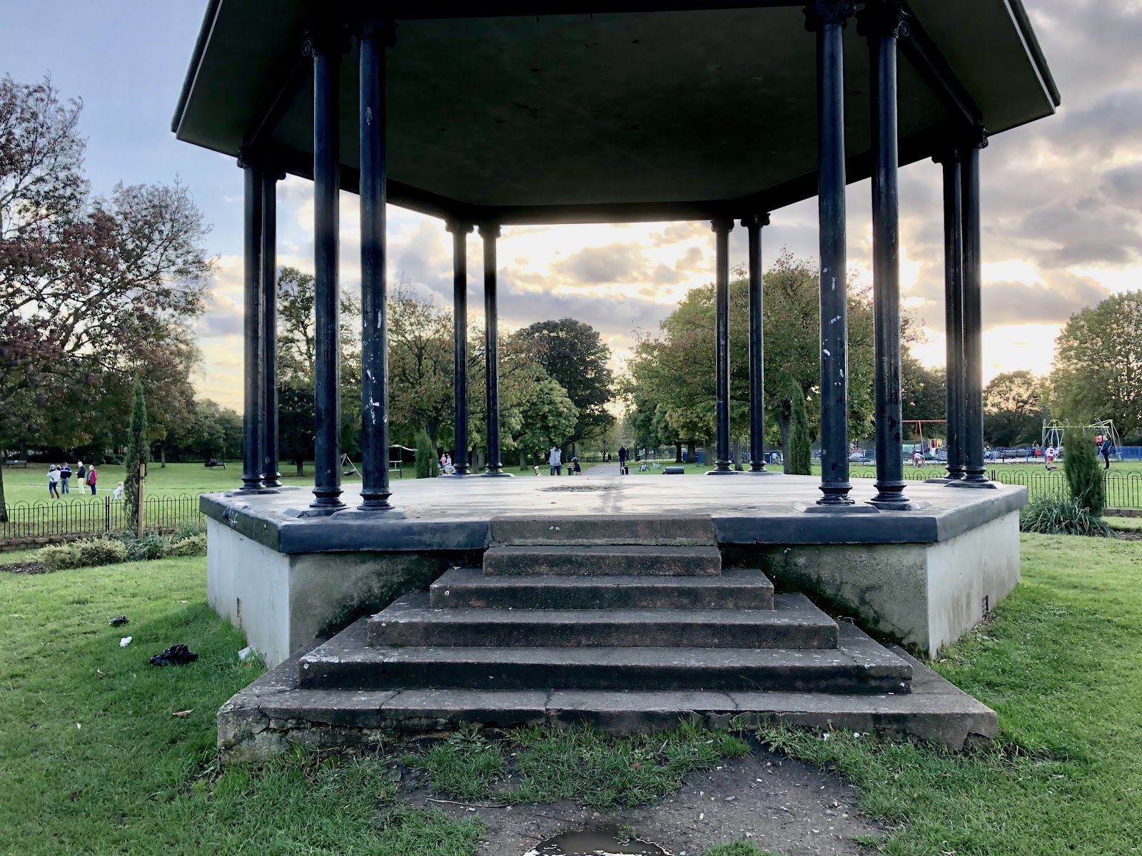
In the park, I am going to use a variety of close up and mid shots of the artist to establish a clear identity and image. For example, when the chorus is playing the artist will be sitting on the bench and steps of the bandstand. This will create verisimilitude between the magazine and music video as they will have similar visuals. This will also be where the artist will be lip syncing the song.
 |


In terms of filming locations, in my music video I am planning to show 3 main locations. The London Underground for the present day shots, the park and bedroom window for nostalgic shots. I might also use a crossing for an intertextual reference to The Beatles 'Abbey Road' album cover. This would immediately be significant for a 30-49 audience.
For one shot in the music video I am going to create a time lapse of the sky when the lyrics play 'I want the world to go away'. This will mean there is a relationship between the lyrics and the visuals in the form of symbolism. I have chosen two locations and will decide which one looks best when editing the final video.

Opening frame showing title of song 'Wasted Years' (changed from 'Teen Idle') and name of artist. The print product will have similar visuals and graphics to the music video with an original title and masthead. This will create a synergistic link for spectators. It will be stylised in a hand drawn way.

For my magazine print product, I am going to have an original masthead 'Record Reader' or 'Record Head' stylised in a cartoon like font to create a synergistic link between the audio-visual and print. This will mean spectators can easily see consistence and each product will reference each other.
This image will be the front cover for my print magazine. The artist will either be sitting down on the steps or standing in the central of the bandstand. I think this will be a powerful image because the sky in the background will be enhanced. This image will be a close up or mid shot. In addition, to create a synergistic link I might include a reference to the video of an image from the stop motion in the sky.


Towards the end of my music video, I am going to edit a long shot of someone looking at the sky. This is an example of what I want to portray. Since we have to use original content I am going to do this in the form of a stop motion animation where I will hand drawn the overlay as a cartoon. I think this will also add to the nostalgic feel of the video.
Graphics:

Opening frame showing title of song 'Wasted Years' (changed from 'Teen Idle') and name of artist. The print product will have similar visuals and graphics to the music video with an original title and masthead. This will create a synergistic link for spectators. It will be stylised in a hand drawn way.

For my magazine print product, I am going to have an original masthead 'Record Reader' or 'Record Head' stylised in a cartoon like font to create a synergistic link between the audio-visual and print. This will mean spectators can easily see consistence and each product will reference each other.

Main title/ cover lines/ pull quotes, straplines:
- Kaya - with her new single 'Wasted Years' from the upcoming album 'Golden Days'
- 'The wasted years, the wasted youth'.
- BTS on 'Later with Jools Holland'
- New emerging artist 'Kaya'
- The ultimate music guide for 2019
- The story behind the rising album 'Golden Days'
- Mention of artists e.g. Paloma Faith, Florence + the Machine
- Interview with the artist 'Kaya' on her new single' Wasted Years' and television performance.
For the main article of the magazine, I am going to use stills from the music video to promote the video. These will be photographed during filming so the visuals are easily recognisable from the video.
Possible images I might use for the double page spread.


Comments
Post a Comment